 "WhatDaFunk" (WhatDaFunk)
02/01/2014 at 13:51 • Filed to: SHOW US
 0
0
 9
9|
"WhatDaFunk" (WhatDaFunk)
02/01/2014 at 13:51 • Filed to: SHOW US | 0
| 9 |

Looking over the !!!error: Indecipherable SUB-paragraph formatting!!! article yesterday on the 10 worst car company logos, the BYD logo caught my eye. Sure, it was bad, but there was something good there in that logo, it was just saddled with a boring oval and some bad supporting typography. So here's my take on redesigning the BYD logo.
!!! UNKNOWN CONTENT TYPE !!!
How about you guys, anyone feel like taking a shot at redesigning some of those boring logos? Have an original idea for a car company logo (real or imagined) you've had knocking around? Show us what you've got!
(EDIT: The image I uploaded doesn't seem to be showing up, if you can't see it try looking here: !!!error: Indecipherable SUB-paragraph formatting!!! )
 dogisbadob
> WhatDaFunk
dogisbadob
> WhatDaFunk
02/01/2014 at 14:31 |
|
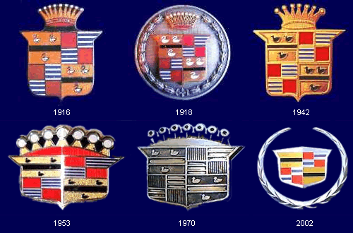
In most cases, it's just a matter of rolling back the logo change and reverting to an older logo.
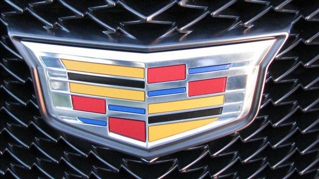
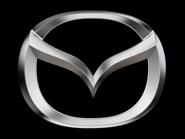
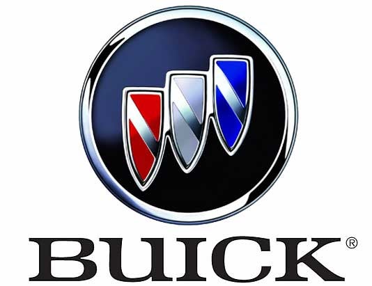
Cadillac, Mazda, and Buick are the most prominent examples.
Stupid new logos:


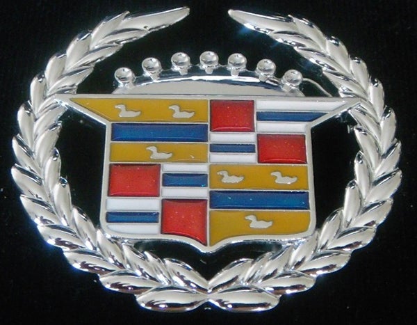
Better, older logos:

|
WhatDaFunk
> dogisbadob
02/01/2014 at 14:48 |
|
I actually like the new versions of these logos better. Well, except for maybe the caddy one, it feels a bit cartoonish, but I think the old caddy ones would look dated on a car now. But styling is, as always, a subjective thing.
 Dst
> dogisbadob
Dst
> dogisbadob
02/01/2014 at 15:08 |
|
I love that old mazda logo not the one that looks like a cobra but the simple m in a circle
|
dogisbadob
> WhatDaFunk
02/01/2014 at 15:09 |
|
I think the old Caddy logos represented presence and untouchableness, like when they really were the standard of the world haha
|
WhatDaFunk
> dogisbadob
02/01/2014 at 15:23 |
|
I agree with you, I think the older caddy logos definitely had more class and sophistication, and actually looking again at their logo from 2002 I think that one strikes the perfect balance between being modern but not losing the company's character.
 Eazy-O
> WhatDaFunk
Eazy-O
> WhatDaFunk
02/01/2014 at 21:10 |
|
If I ever build a car on my own, the logo would have incorporate the coat of arms of my hometown:

Perhaps modified, but as far as I understand heraldry, the coat...s(?) are subjective visual representations of descriptions, which is what objectively defines the coat of arms.
Aaanyway, it has a dragon and a castle and so does my hometown and that is badass.

Castle's kinda hidden in the trees of the hill, but you get the idea.
I just hope my vehicle doesn't get mistaken for a Gilbern, though those are pretty damn neat if you ask me:
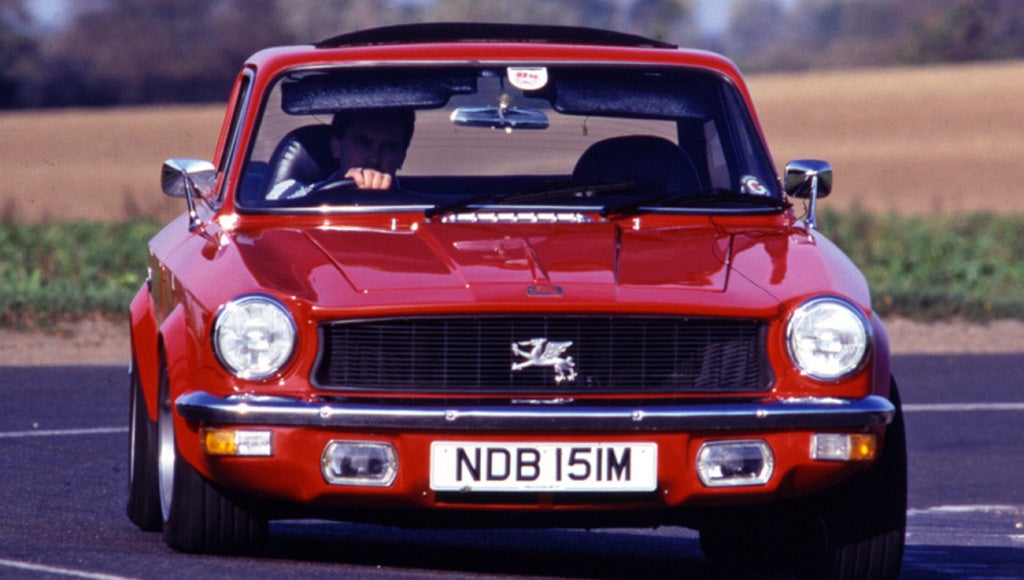
Gilbern Invader pictured.
 Axial
> dogisbadob
Axial
> dogisbadob
02/02/2014 at 01:58 |
|
The only way I think the new Cadillac logo works is if it has a chrome "V" underneath it to stand in for the banished wreath. As is, it looks too barren.
|
WhatDaFunk
> Eazy-O
02/03/2014 at 01:21 |
|
I took a shot at making a logo based on your town's coat of arms:

 BeholdTheCamaro
> WhatDaFunk
BeholdTheCamaro
> WhatDaFunk
02/08/2014 at 18:02 |
|
Agreed. The 2002 logo should have stuck around. I miss it. This new logo is cartoonishly stretched and the wreath's gone.
Other than the logo, I love the direction Cadillac's headed though. Their exterior design has been awesome. Bring me more Escalade redesigns and CTS-V's please.